
My Choice? @ Sunday, 22 January 2012
After days and days of research on the list of art movements, I was looking into Cubism and Color Field and as a conclusion I finally finalize myself on Color Field and Fauvism. There are lists of art movements that attracts my attention and it was really hard to choose one that is simple enough to express my ideas on as each and everyone of them are very unique.
Introduction to Color Field
Color Field painting is a style of abstract painting that emerged in New York City during the 1940s and 1950s. It was inspired by European modernism and closely related to Abstract Expressionism, while many of its notable early proponents were among the pioneering Abstract Expressionists.
Color Field is characterized primarily by large fields of flat, solid color spread across or stained into the canvas creating areas of unbroken surface and a flat picture plane. The movement canvas creating areas of unbroken surface and a flat picture plane. The movement places less emphasis on gesture, brushstrokes and action in favour of an overall consistency of form and process. In color field painting "color is freed from objective context and becomes the subject in itself"
Usage of Color Field in older times
During the late 1950s and 1960s, color field painters emerged in places such as Great Britain, Canada, Washington, DC and West Coast of the United States using formats of stripes, targets, simple geometric patterns and references to landscape imagery and to nature.
Images of Color Field


During the late 1950s and 1960s, color field painters emerged in places such as Great Britain, Canada, Washington, DC and West Coast of the United States using formats of stripes, targets, simple geometric patterns and references to landscape imagery and to nature.
Images of Color Field
Henri Matisse
View of Notre Dame, 1914, Museum of Modern Art.
It has exerted tremendous influence on American Color Field painters in general.
Elements of design
Line: straight lines, vertical and horizontal
Shape: Rectangular, Square
Value: Absent
Color : non saturated
Texture: Oil Canvas
Alignment & Proportion: unbalanced
Eye Movement: absent
Principles of design
Balance: Yes, the colors are spread evenly
Proximity:Yes, far objects seems to be smaller in size
Repetition: No Repetition
Scale:No
Unity: Yes, nice flow of colors and contrast
Ronnie Landfield
Rite of Spring, 1985.
His works are reflections of both Chinese landscape painting and the Color Field idiom.
Elements of design
Line: horizontal
Shape: uncertain
Value: yes
Color : saturated
Texture: Slightly rough
Alignment & Proportion: unbalanced
Eye Movement: absent
Principles of design
Balance: Yes, a well balance of colors
Proximity: Not obvious
Repetition: Yes, the colors and patches of colors are repeated
Scale: No
Unity: Yes, nice flow of colors
Introduction to Fauvism
At the start of the 20th century, two young artists, Henri Matisse and Andre Derain formed the basis of a group of painters who enjoyed painting pictures with outrageously bold colors. The group were nicknamed 'Les Fauves' which meant 'wild beasts' in French. Their two main characteristics is simplified drawing and exaggerated colors. Their title was coined by the art critic Louis Vauxcelles who was amused by the exaggerated color in their art. At the Salon d'automne of 1905, he entered a gallery where Les Fauves were exhibiting their paintings. Surprised the contrast with a typical renaissance sculpture that stood in the center of this room, he exclaimed with irony, "Donatello au mileau des fauves" which meant Donatello in the middle of the wild beasts! That's how the name stuck. Besides that, Fauvism was an art style that lasted only four years. It's beginning was in 1905 and this movement was lead by Henri Matisse. The word Fauvism in French means "wild beasts" The reason behind this name is because the paintings had bring and unusual colors. The subjects in the painting were shown in a simple way. The colors and patterns were bright and wild.
Images of Fauvism
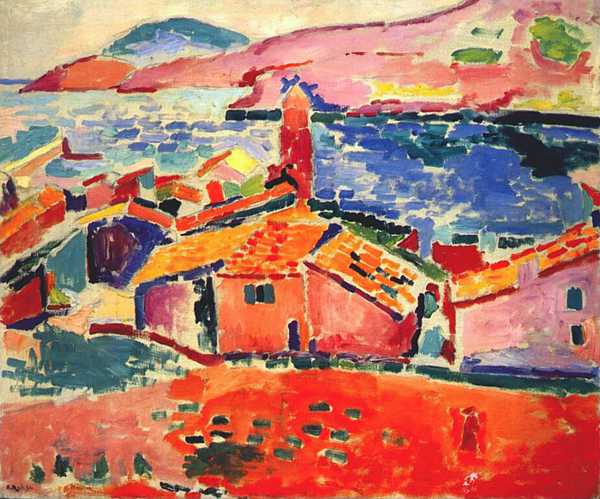
Henri Matisse (1869-1954)
The Roofs of Collioure
Elements of design
Line: straight lines, curves, vertical and horizontal
Shape: Rectangular, Square
Value: Present
Color : Saturated
Texture: have a rough texture
Alignment & Proportion: Balance
Principles of design
Balance: Well balance of color
Proximity: big objects are shown as larger
Repetition: not really have much use of repetition
Scale: Well scaled
Unity: A smooth flow for the objects and color
Henri Matisse (1894)
Woman Reading
Elements of design
Line: straight lines, vertical and horizontal
Shape: Rectangular, Square, Triangle
Value: Absent
Color : non saturated
Texture: majority smooth
Alignment & Proportion: Are fairly balanced
Principles of design
Balance: well balance for both contrast and colors
Proximity: nearer object are larger
Repetition: not used.
Scale: Yes
Unity: A nice flow of colors and contrast
As for my reference artist of choice, to be continue...even there's a little hint here :)
Labels: HAA102